The existing process of Hardware Design at Honeywell GES (Global Enginerring Services)was all manual and need was to create a tool that will digitize this process. There were constant feedback from customer's about quality and lot of efforts were invested in the QC process. There was a need for a tool that can automate most of the manual work and make the entire delivery process more efficient, competitive and reduce QC time
GHET
Project Details
Challenge: To digitize the hardware design process (from System Design to BOM) at GES.Client: GES Honeywell (In House)
Role: UX Lead
Duration: November 2016 – February 2017
Contribution
User Research (Interview)Persona Development
Task Flow
Information Architecture
Wireframes
Visual Design
Tools Used
Pen and PaperPencil (Wireframing Tool)
Adobe Photoshop
OverView
User Study/VOC
As a first step, Conducted VOC of 3-4 engineers with different designation and roles, who are creating BMS hardware drawings manually. We scheduled meeting with them in groups and in person to understand their work process and pain points. I also observed them working on live projects to understand the actual work process.

Design Objectives
- Create a platform for informal but professional dialogue in the form of question and answers.
- Design an easy to use tool to create, design and manage projects
Task Flow
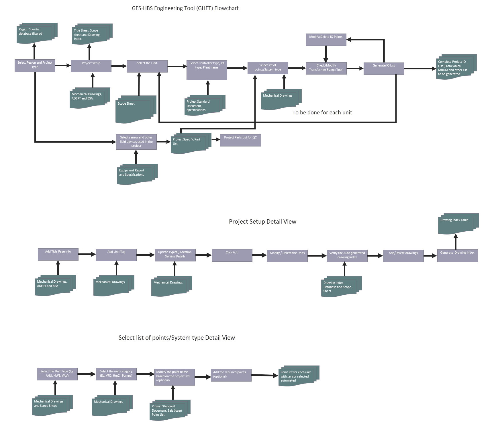
In the next step, I worked closely with the engineers to establish a data inventory. Based on this, relationship between various features were identified. This knowledge was used to develop content flow diagrams.

Sketching Interfaces
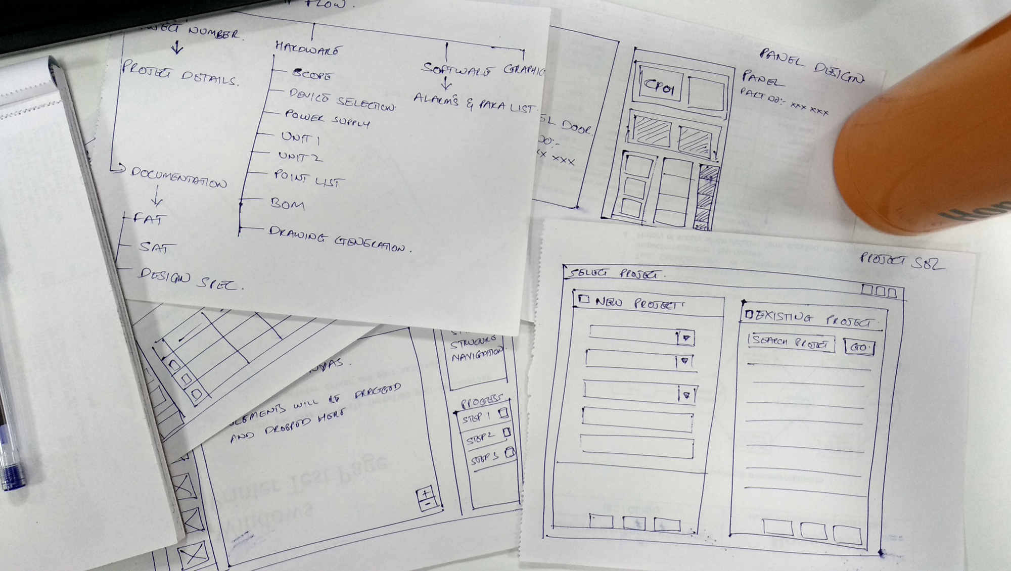
After validating task flows, I started work on user interface. I find pen and paper to be the most efficient medium for fleshing out ideas.

Wireframes
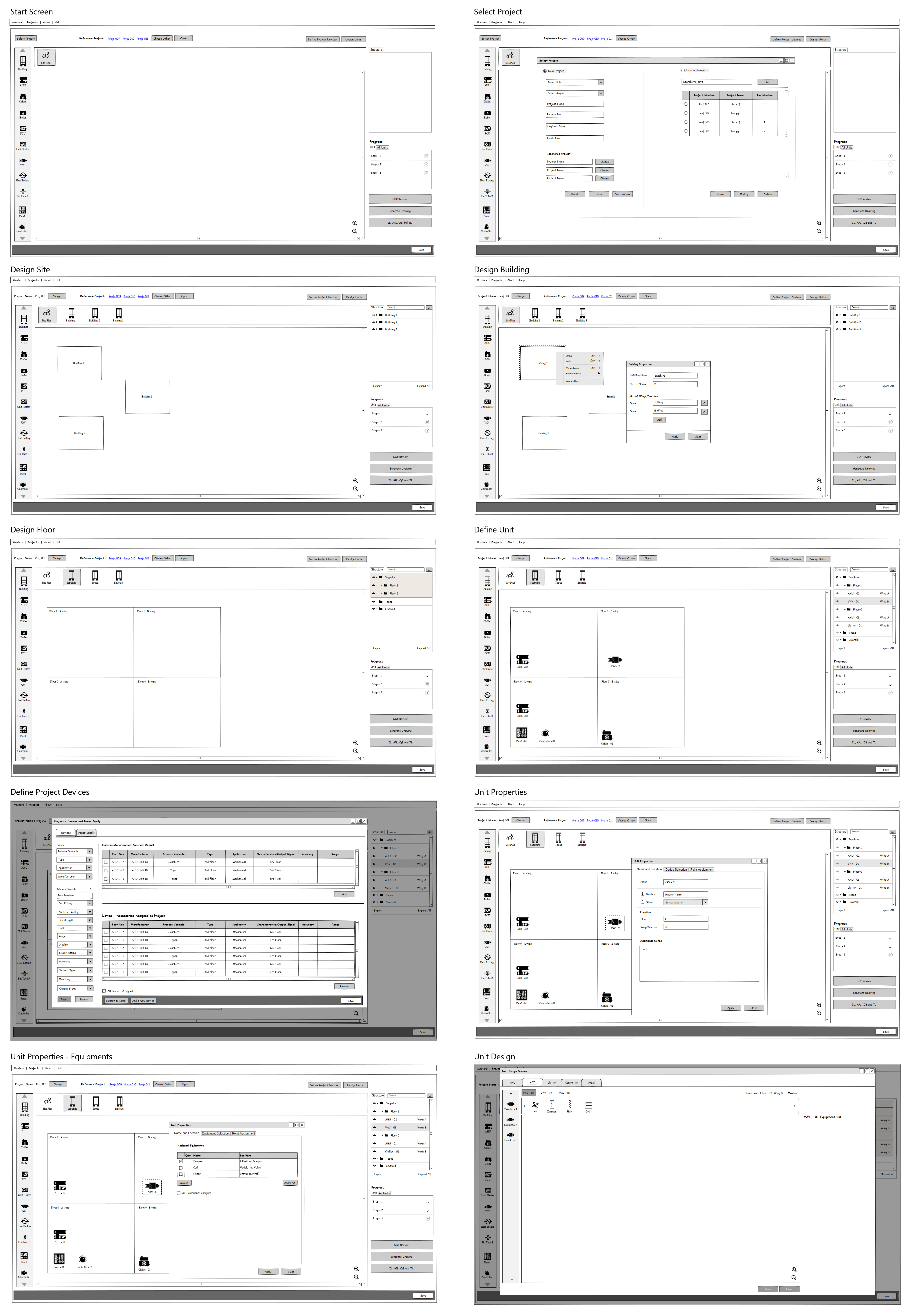
Low fidelity sketches, notes and scribbles together formed the foundation for wireframe development. At this stage, I started identifying element behaviour and interaction patterns. Task flows were further broken down and local actions are specified.

Visual Design
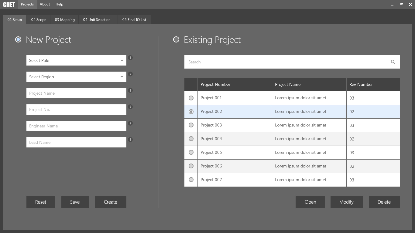
Once the skeleton of the product was ready and approved, I came up with suitable content to set the right tone for the product. The colors were used from Honeywell’s Primary and Accent palette. Color tone and typography were set as per standard Honeywell Design Language
