ServiceBench connects the people who make and sell products to the people who install and service them. A single point of contact receives customer repair requests and tracks service to completion. They Used PEGA software for their customer engagement and digital process automation. Their need here was to reduce the time taken by CCR (Customer Care Representative) to log a service complaint using the tool.
I was in US when this requirement came up, I met the Business Development Manager in person to get a first hand glimpse of the problem.
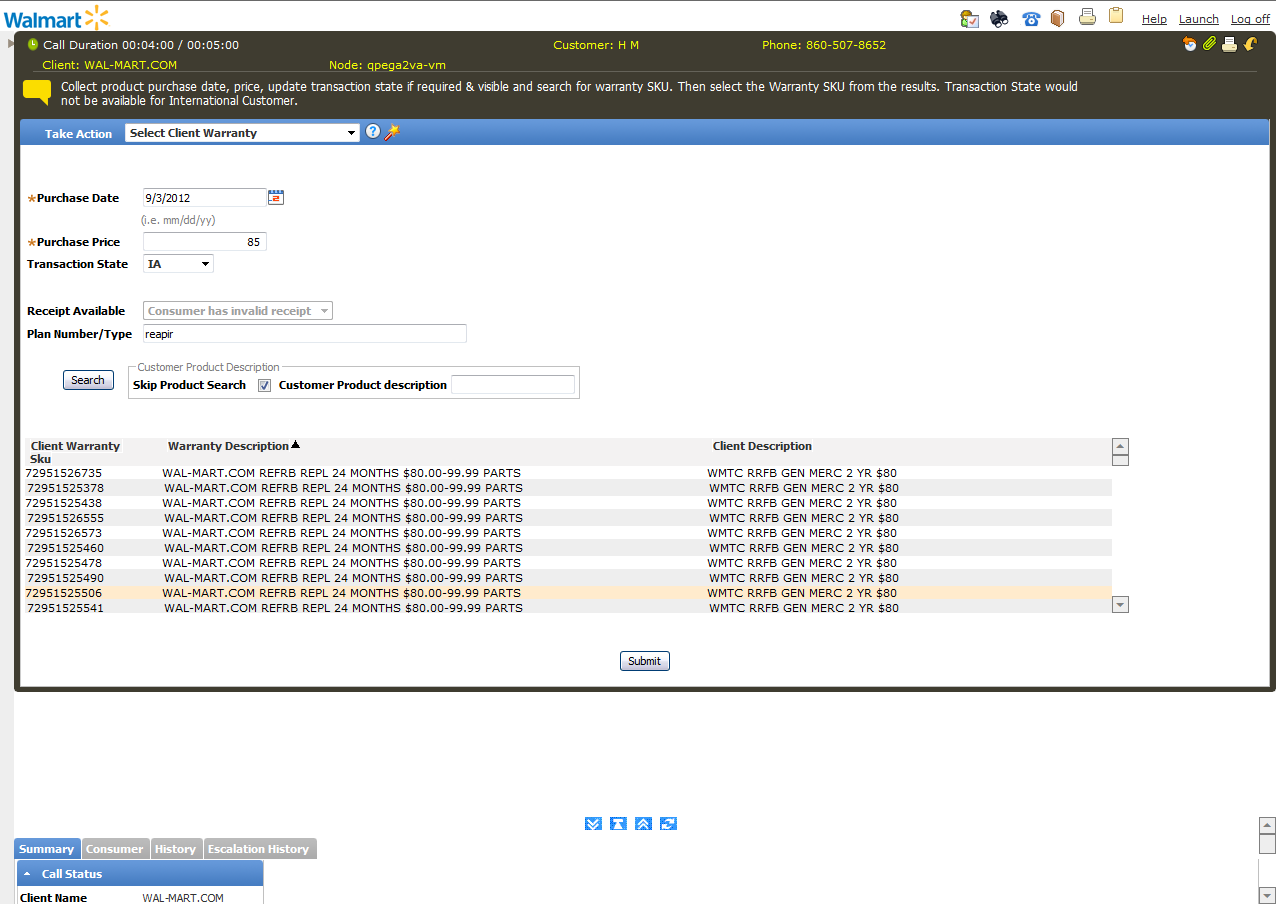
PEGA CCR Screen
Heuristic Evaluation, Wireframe
Project Details
Challenge: Identify and improve end user usability in PEGA screens used by CCR’s. Since PEGA is a framework not much customization was possible. So, the solution to be provided had to be well thought out.Client: Service Bench
Role: UX Lead
Duration: May 2012
Contribution
Heuristic EvaluationWireframes
Tools Used
Pen and PaperAxure
OverView
GUERRILLA TESTING
Since there was no budget for a comprehensive user research, I planned a quick guerrilla study over phone with two CCR and their Manager. This gave me a glimpse of the problem environment to identify pain points and come up with actionable ideas.
Existing PEGA Screen Limitations
- Overall UI needs enhancement in respect with Structure, Placement & Position
- Lot of space is going un-utilized
- Difficult to view Data of Composite panel and the Work Area panel at the same time

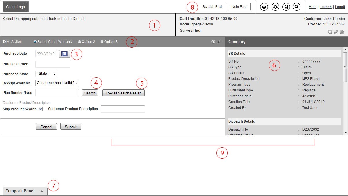
Proposed UI Improvements

- Position and Placement of the Script Section, Welcome Message Section and the Additional Call info Section has been changed to make it look more structured
- Take Action Options are proposed to be used as radio buttons in place of dropdown menu to reduce the number of clicks from two to one.
- Date Picker displayed as overlay instead of popup.
- Plan Number/Type Search results displayed in an overlay. This helps us to free up lot of horizontal and vertical space which was initially blocked for search result.
- Additional Button “Revisit Search Result” added next to Search button to help the CCR to open the result overlay incase he/she selects a wrong plan in their previous attempt.
- Summary Section makes up the Right Section of the layout. Summary is a part of the Composite Section and gives a Brief view of the SR, Dispatch and Failure Details.
- Composite Panel is aligned to the bottom of the screen, by Default it will be in the collapsed mode and expands as and when clicked by the CCR. It does not have the various up down toggle buttons as in the current framework.
- The Scratchpad and Notepad options are moved to the Header section and they appear as overlays. Displaying them as buttons/tabs helps us remove the expand/collapse frame as present in the current layout. We had initially thought of placing them on the right side next to summary, but that will affect the visibility of the data of Summary section once either of the tabs is open.
- The Data section and the Summary section will never collapse, as it happens in the current framework.